EYB is now accessible and translatable

We have added a very cool tool to EYB that improves the usability of the site for our members with disabilities. Click the new green symbol at bottom left of your screen and see all the options – specific accessibility profiles like blind, color blind, dyslexia or ADHD can be selected and the site will adjust accordingly. Or you can customize the site features such as font size, spacing, color contrast, etc to suit your own preferences.
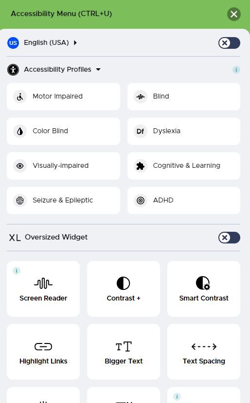
Another exciting feature of this tool, for our members who do not speak English as their first language, is that you can now translate the site to any of the main languages of the globe. Or even if you don’t speak another language you may want to view a recipe in say French to learn how the ingredient names translate.

If you don’t want to see the icon, there is the option to move or hide it. Scroll to the bottom of the menu and select Hide. You then can select the time period for it to be hidden. If you later decide you want to see it again, type CTRL U and it will reappear.

And another new feature that has gone live today is that Serves is listed at the bottom of the ingredients list (when that data has been stored).

We would love to hear members experiences using the new accessibility tool.

Post a comment

17 Comments

  • racheljmorgan  on  January 18, 2024

    I love the serves info. Knew the info was there from indexing a bit, but nice to see it go live as a user.

  • darcie_b  on  January 18, 2024

    Very cool features!

  • eliza  on  January 18, 2024

    Features are great for those who need them. Is the “hide widget” menu working? I’ve tried to hide it several times without success. It keeps reverting…

    • Jane  on  January 18, 2024

      Do you mean that when you close the accessibility tool it reopens? I cannot reproduce this and no-one else has reported it. Maybe try doing a screen refresh? If the issue persists please email us with details of the device and browser you are using and we can then investigate further.

  • redbird  on  January 19, 2024

    Eliza, I experienced the same thing at first. I clicked the hide widget button but it would come back. Then, after clicking it again, I continued to scroll down and noticed more buttons. One is to pick the length of time to hide it and I chose “indefinitely.” I believe there was one more to confirm hiding it. That resolved the issue for me. Hope that bit of info helps you.
    Now I wonder how to get the widget back if I do indeed need these features in the future!
    Thanks, Jane, for this enhancement. I am sure that it will be a great help for many.

    • Jane  on  January 19, 2024

      redbird – to restore the accessibility widget, type CTRL U and it reappears. I will add this to my blog post.

  • eliza  on  January 19, 2024

    Hi Jane and Redbird and thank you for responding to my issue. I did choose the time of “indefinitely” and it didn’t seem to work. However, I have now logged out and logged in again and it seems to be resolved.

  • pitterpat4  on  January 19, 2024

    Thanks. Great additions to the site!

  • Pirateemma  on  January 19, 2024

    Love these options. When I selected to move the new widget location to the right, it nearly covers the existing “Need Help” box. Could this be adjusted above or to the side a bit?

    • Jane  on  January 19, 2024

      The Need Help button is still able to be clicked so it’s not a priority for us to spend development time on moving the widget icon location. And I’m not even sure it is possible. Out of interest, why do you want it on the right side when the left side has no other icons?

  • chawkins  on  January 19, 2024

    Very neat features!

  • demomcook  on  January 19, 2024

    Love all of this! I am legally blind and I work as an accessibility consultant. Cannot begin to tell you how much of a difference this will make for people. I’ve set all of my features up just now, and I can already find a big difference in just being able to type out this message with the wonderful line spacing option. THANK YOU!!!

  • demomcook  on  January 19, 2024

    Is there a way to scale the drop down menus under at the top/left of the page? I’m now only seeing “Home”, “My Bookshelf” and “Library”, and on the menus themselves I only see the down to the magazine selection. Cannot find how to scroll down with the larger text.

    • Jane  on  January 19, 2024

      The tabs at the top have always been Home, My Bookshelf, and Library so I’m not sure what you think is missing. I couldn’t replicate the issue of missing lines on the drop-down menus and I went up to the largest text size. Can you please email a screenshot of what you see and also let us know what device and browser you are using?

  • Rinshin  on  January 19, 2024

    Very helpful. I like the higher contrast. The light blue was too muted in the past.

    Great features. Thank you.

  • Mrlew1  on  January 20, 2024

    This is excellent news. Thank you!

  • Zephyrness  on  February 4, 2024

    I finally got around to looking at this and I do not see what is shown above. I see 4 accessibility profiles: Motor Impaired, Blind, Dyslexia, and Cognitive. The other 4 are not listed. I’m using Firefox 122 on a Mac. Not a big deal for me, but might be for others?

Seen anything interesting? Let us know & we'll share it!