When size matters
November 13, 2020 by DarcieThanks to virtual meetings and interviews – and the Twitter account Room Rater – I have seen gobs of bookshelves this year. It’s easy to see why so many people chose to have a bookshelf in their Zoom background – it makes you look smart and sophisticated, unlike the unmade bed that you would see if I turned on my laptop’s camera right now. As a book lover, I am always keenly interested in how people organize their collections, a topic that I have written about before.

While Room Rater thinks that grouping books by color is bad form, they don’t have much else to say about organizing bookshelves. I have developed a system that works for me 99% of the time – I split my books into categories: baking books, cookery books, reference books, cocktail books, and so on. Each category is arranged by the author’s last name. It works…at least until I run into an oversized volume.
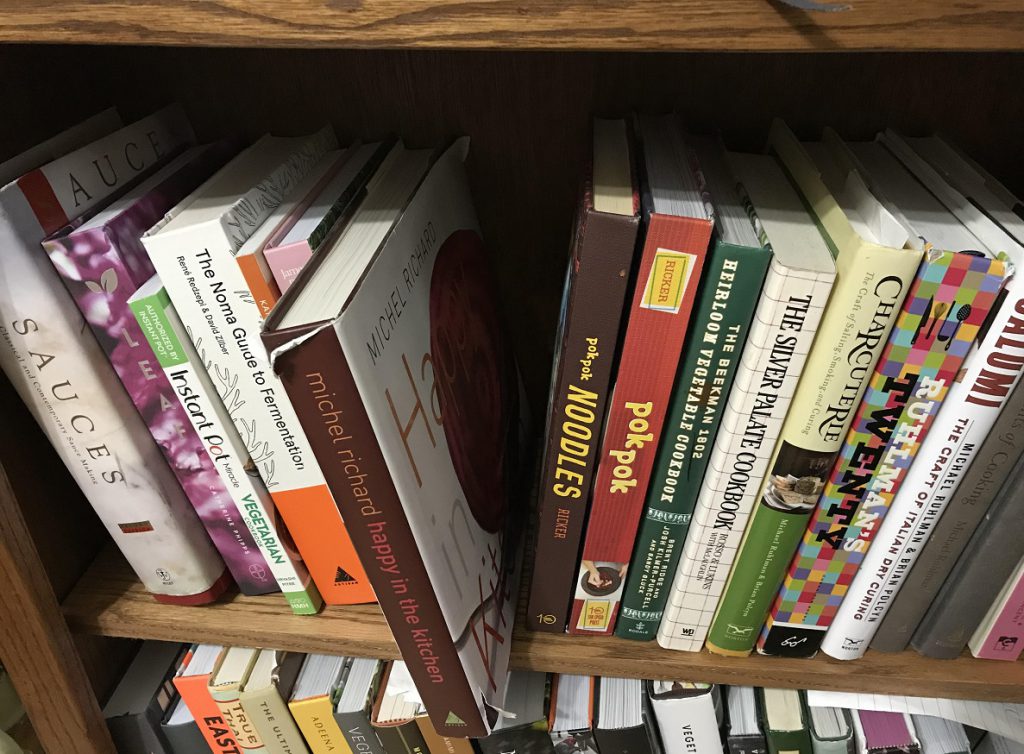
Most, but not all, of these are books written by famous chefs. You can see Michel Richard’s book Happy in the Kitchen sticking out in the shelf above. If I place it in its proper alphabetical position, not only does it obscure the surrounding books, it often ends up getting bumped, causing damage to the book jacket or spine. My solution is to place the book on its side on top of the bookcase, joining other such unwieldy volumes like Alinea and Hot Sour Salty Sweet.
I don’t mind slight differences in the heights and widths of books; if they were all the same size it would be boring. Widely disparate measurements (especially the length), however, set my teeth on edge. Not only is it difficult to shelve these monsters, if you actually want to cook from them they take up an inordinate amount of room when opened. In my small kitchen, I don’t have counter space to spare, so I end up putting the book in the dining room and running back and forth, or wasting paper to make a photocopy.
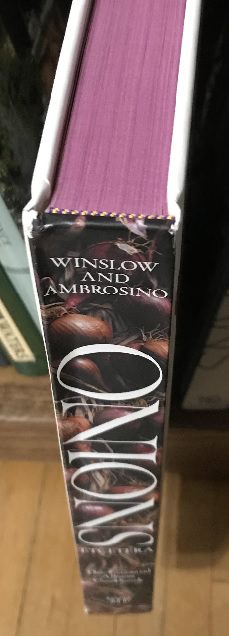
With everything that is going on in the world, I realize this is a minor quibble. Even in the best of times it is not a big deal. But it does cause me to use those cookbooks less often than others more conveniently sized. If a cookbook designer really wants me to love and use a book, she or he will incorporate a couple of bookmark ribbons. The icing on the cake is when books feature edge painting. The book Onions Etcetera boasts a lovely color on the page ends, fittingly reminiscent of red onions. It is a wonderful finishing touch and shows a level of care that is all too rare.

Typesetting is another area where a good design encourages me to come back time and again, but a bad one makes me want to put the book away. I don’t particularly care whether the ingredients list is to the side or above the instructions, whether there is one column or two, I only want the type to be legible. Some authors (or publishers) choose avant garde designs that might be striking, but if I can’t read it without getting a headache, I’m not going to use it. Luckily those books are few and far between.
How do you handle oversized books, and which cookbook design features appeal to you?
Categories
- All Posts (6940)
- Antipasto (2135)
- Author Articles (247)
- Book News (935)
- Cookbook Giveaways (983)
- Cookbook Lovers (257)
- Cooking Tips (109)
- Culinary News (299)
- Food Biz People (552)
- Food Online (791)
- Holidays & Celebrations (272)
- New Cookbooks (149)
- Recipes (1500)
- Shelf Life With Susie (231)
- What's New on EYB (133)
Archives
Latest Comments
- Pamsy on What foods do you look forward to the most for each season?
- Pamsy on How cookbooks can help build resilience
- DarcyVaughn on Danube Cookbook Review and Giveaway
- hettar7 on JoyFull – Cookbook Review & Giveaway
- eliza on What foods do you look forward to the most for each season?
- kmwyman on Rooza by Nadiya Hussain – Cookbook Review and Giveaway
- Maryd8822 on The Golden Wok – Cookbook Giveaway
- Dendav on Danube Cookbook Review and Giveaway
- sanfrannative on Rooza by Nadiya Hussain – Cookbook Review and Giveaway
- darty on Danube Cookbook Review and Giveaway