The Font That Ate 2014
November 4, 2014 by SusieI don’t usually make a big deal about typefaces in cookbooks, except to complain when they are too small. But every once in a while the jackets all suddenly start to look eerily similar, and once you figure out why you can’t help but say something. Have a look:
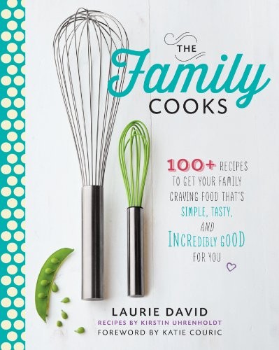

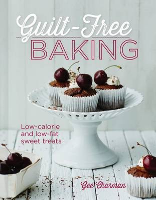
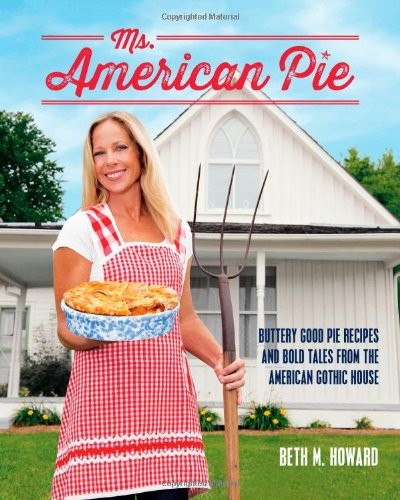
See something funny? Other than that they’re mostly baking books? That’s right – they’re all using the same font. (Or very similar knock-offs thereof.)
The name of the font – or at least the name of the most popular version – is “Thirsty Script”. It was released by Yellow Design Studio, a Wisconsin-based design firm, in just 2012. The very similar “Delicious Pro” was released by Lee Schulz in 2013. What these fonts have in common (besides roots in Wisdom Script and Lobster font, for you font geeks out there) is a nostalgia for an era of vintage design – let’s call it the late 50’s or very early 60’s – evocative of chrome, delicatessens, drugstore sodas, and finned cars.
It’s a jovial, tasty, juicy sort of typeface, which probably accounts for its success on the cookbook covers this year. The distressed versions look like they’re dusted in confectioner’s sugar or flour – they’d be right at home on a pastry box tied up with butcher’s twine.
It’s not like they’re all coming from the same publishers either. It’s like the design hive mind just suddenly got a taste for this look, across the board. In my mind at least, Thirsty Script will always be associated with the dozens of pie books released in 2014.
Anyways, enjoy it while you can – I dare say the fact that someone actually noticed will probably mean that this font has jumped the shark, in the lightning-fast world of design trends. We’ll probably be moving on to some psychedelic 70’s font in six months, and then, won’t we miss Thirsty Script?
Categories
- All Posts (6940)
- Antipasto (2135)
- Author Articles (247)
- Book News (935)
- Cookbook Giveaways (983)
- Cookbook Lovers (257)
- Cooking Tips (109)
- Culinary News (299)
- Food Biz People (552)
- Food Online (791)
- Holidays & Celebrations (272)
- New Cookbooks (149)
- Recipes (1500)
- Shelf Life With Susie (231)
- What's New on EYB (133)
Archives
Latest Comments
- Atroyer7 on Danube Cookbook Review and Giveaway
- demomcook on What foods do you look forward to the most for each season?
- demomcook on Danube Cookbook Review and Giveaway
- Darcie on How cookbooks can help build resilience
- mholson3 on Danube Cookbook Review and Giveaway
- Rinshin on How cookbooks can help build resilience
- sarahawker on Danube Cookbook Review and Giveaway
- Sand9 on Danube Cookbook Review and Giveaway
- hankintoby29 on Heritage Cookies of the Mediterranean World – Cookbook Giveaway
- WBB613 on Feasts of Good Fortune Cookbook Giveaway